Case study · Shopify rebuild
Progress Jiu Jitsu





The brief
Progress Jiu Jitsu have sold BJJ kit for over fifteen years, across four markets — the UK, EU, US and Australia — through one Shopify store, to two very different customers: consumers, and the gyms and distributors who buy wholesale.
The store they came to us with was a heavily modified theme, one of fifty-four in the admin, with a name that told the whole story: years of patches on patches, each version named after the problem it was last trying to fix. The brief was a new storefront, designed in Figma and built custom, with the wholesale business treated as a first-class part of the site rather than an app bolted on the side.
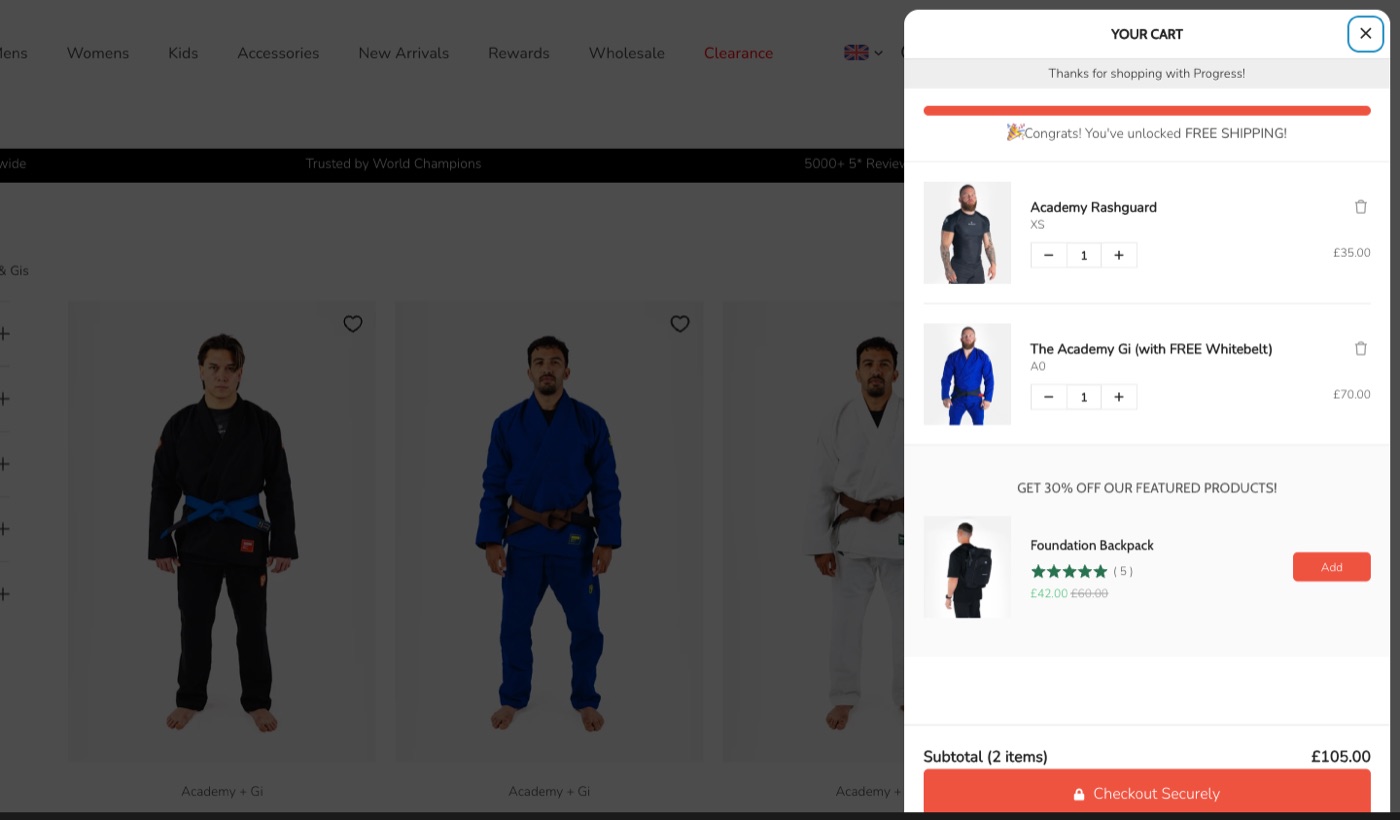
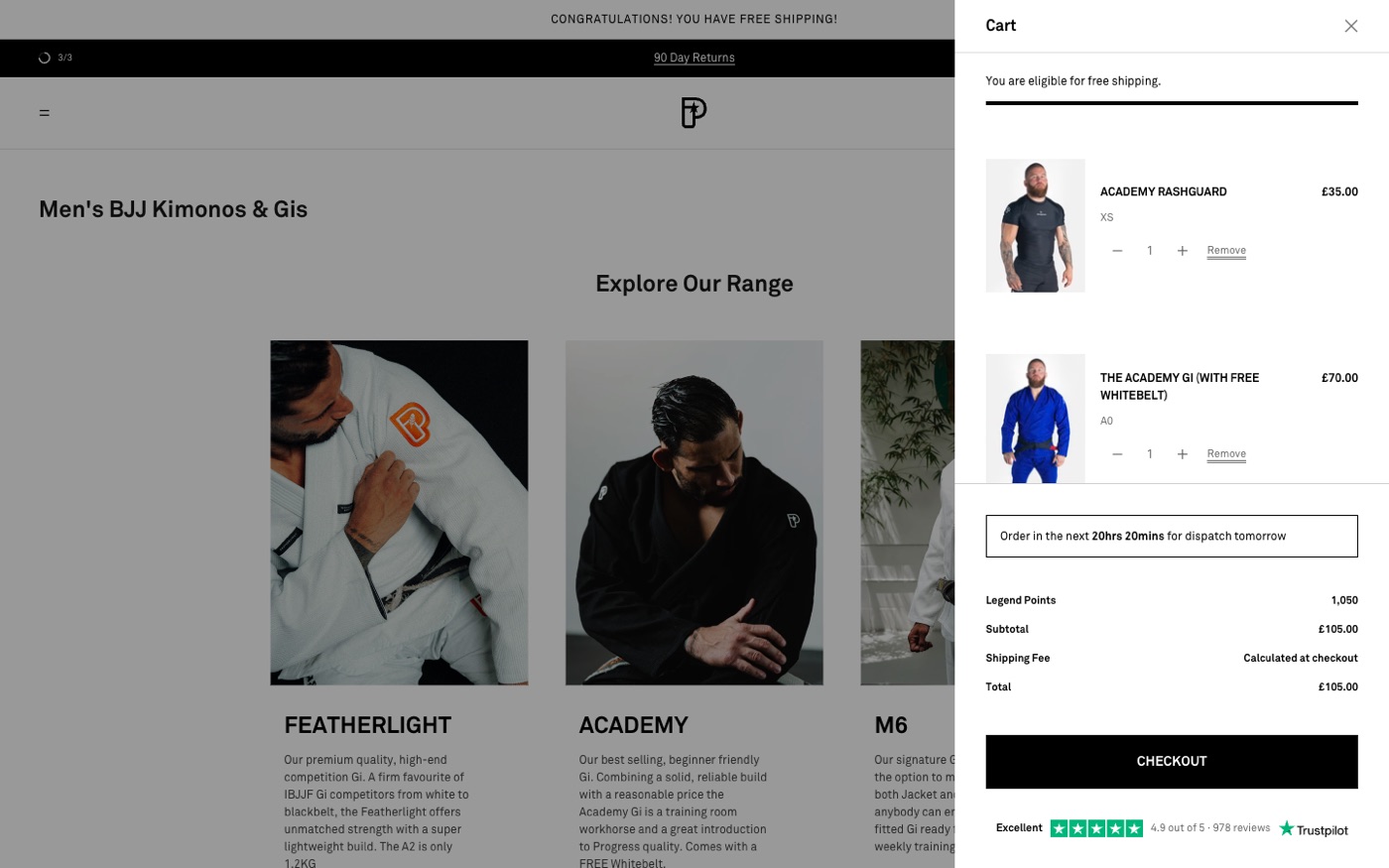
Before & after

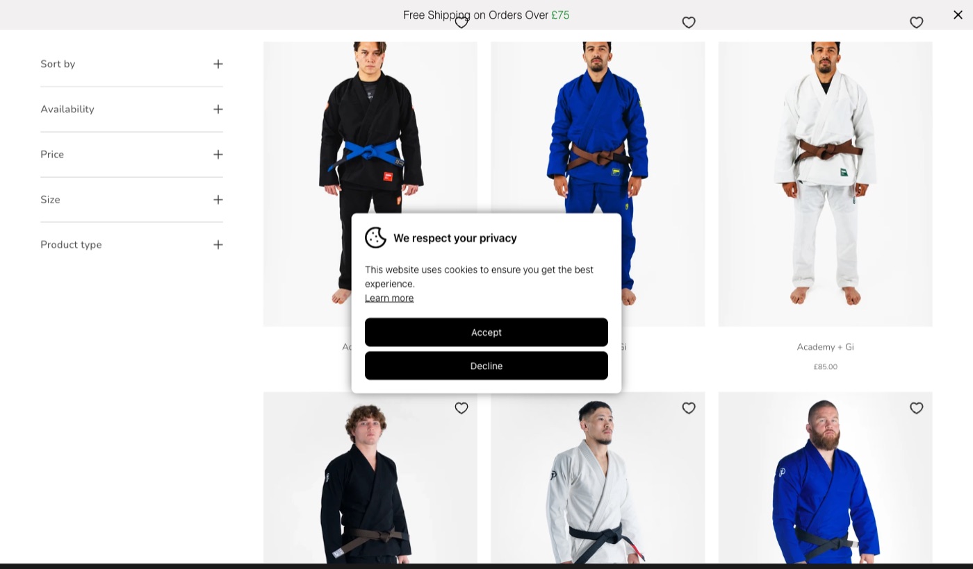
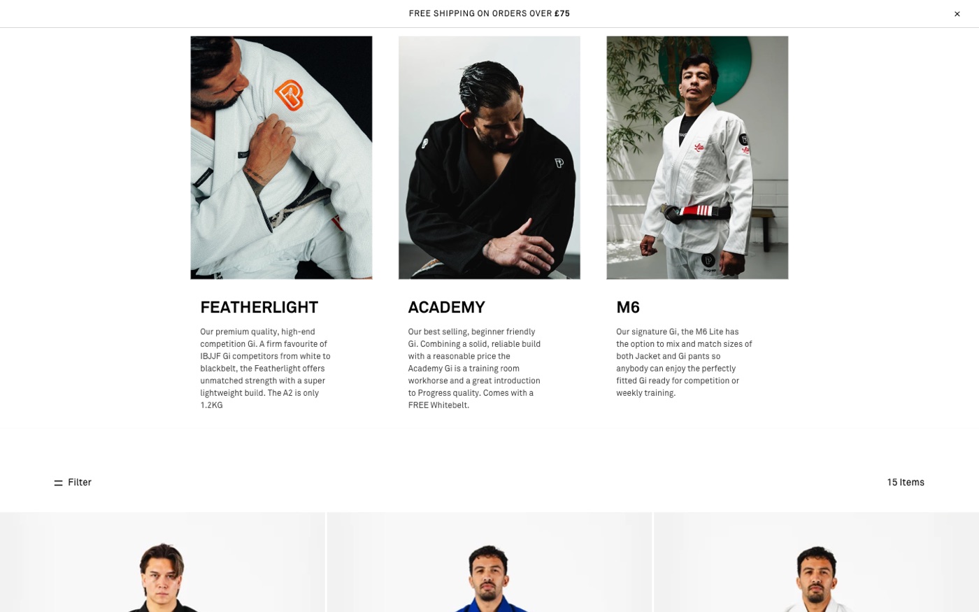
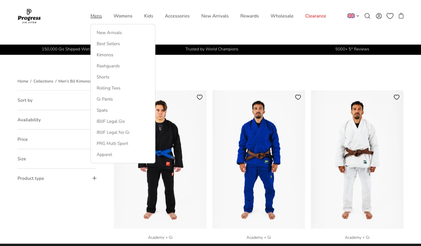
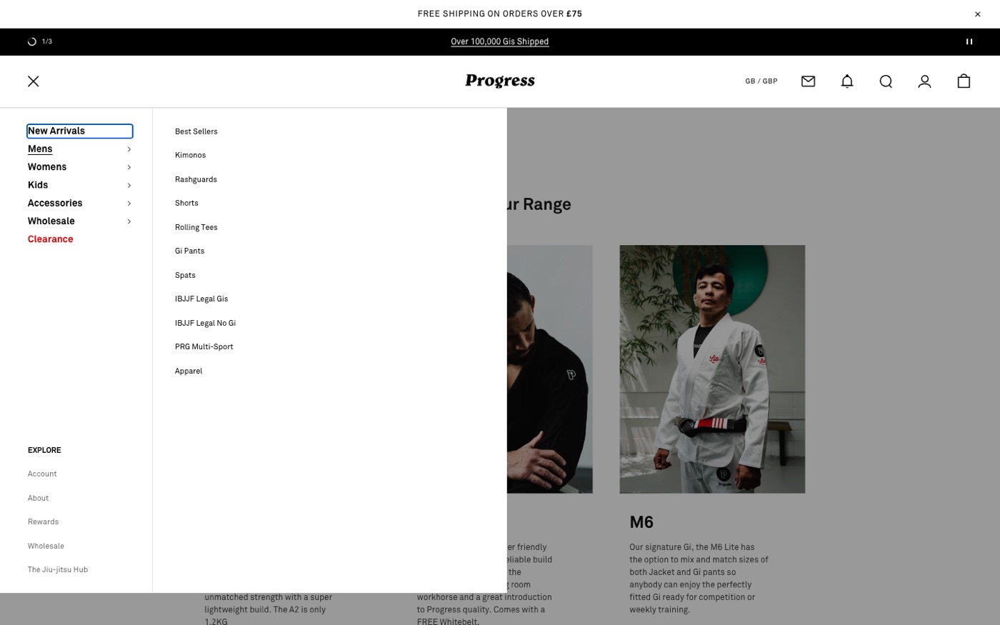
What we built
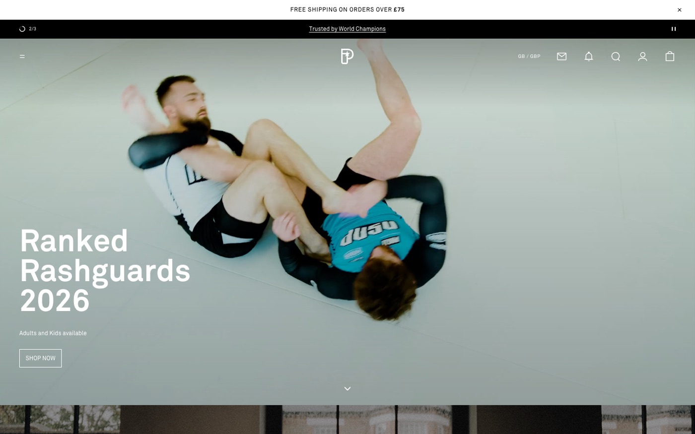
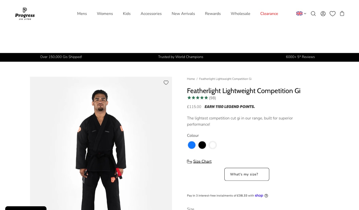
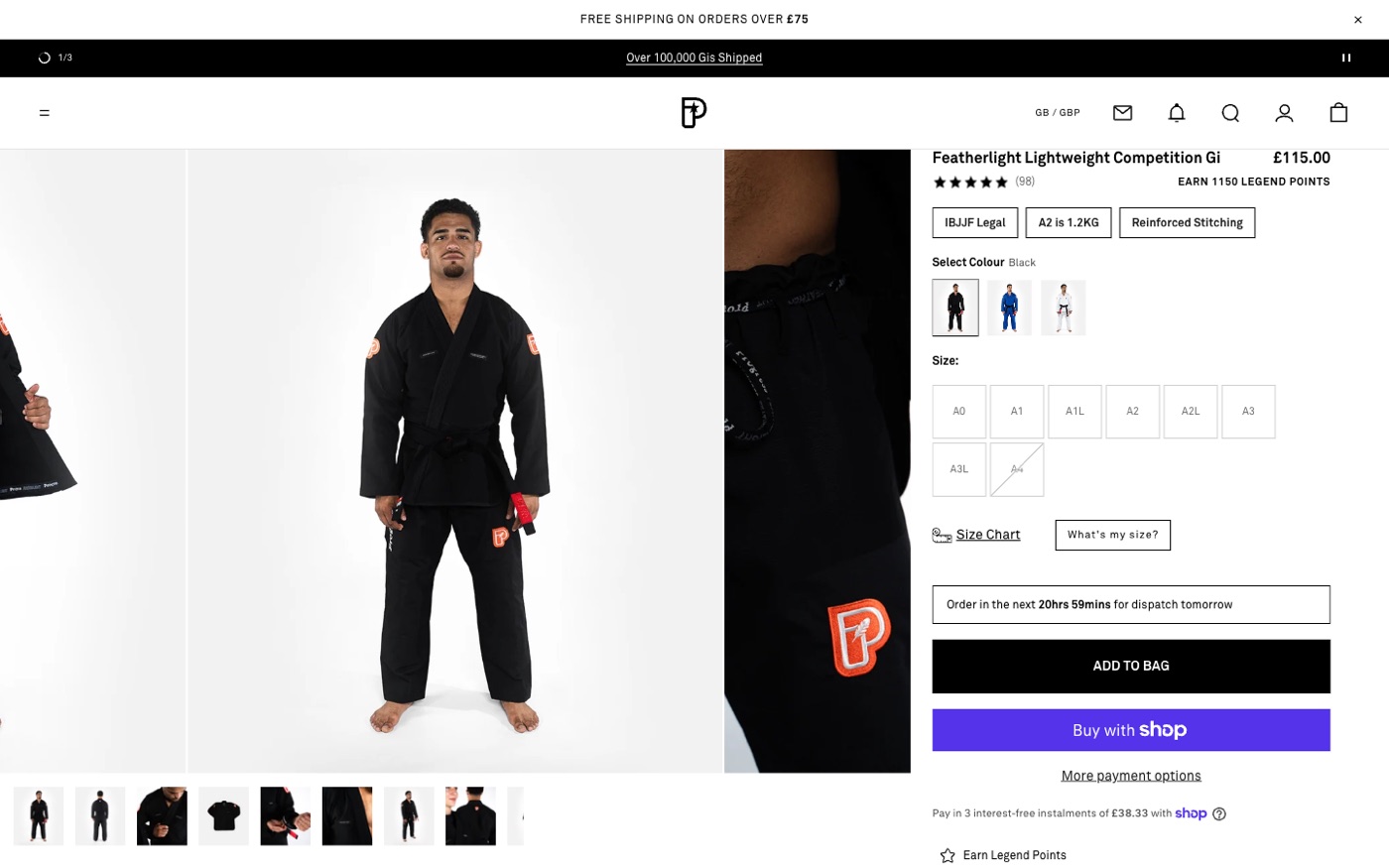
The storefront. A custom build on Prestige, with every section written from the Figma rather than configured out of the box. Everything is namespaced — our own classes, properties and filenames — so the parent theme can be updated without taking our work with it.
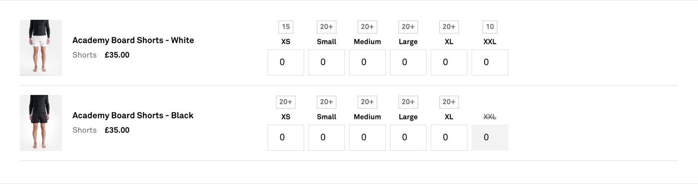
Wholesale as a real experience. A trade order form where a buyer types quantities against a size grid and adds a whole order in one go, with live stock on every size. Trade prices now show on normal product pages and collection cards too, because the smaller wholesalers shop the site like anyone else.
Bundles. Mix-and-match gis and starter bundles, where the jacket and trousers are separate products with their own stock, presented as one purchase.
Loyalty. One page that changes with who is looking: the pitch for a visitor, their points and rewards for a member — decided on the server, so a member never sees a sign-up pitch flash before it disappears.
Coming soon. One tag turns a product into a launch: a badge on the card, a launch date on the page, and the sold-out button replaced with a notify form.
The bag. The slide-out bag is built to convert: a free-shipping progress bar, a dispatch countdown that turns delivery into a reason to order now, loyalty points earned on the order, and the store’s review rating — all without leaving the page.
Merchandising. Comparison tables between similar products, range cards, infinite scroll on collections, ratings on cards, a market-aware country selector, and a free-shipping bar that can hold a different threshold per country inside a single market.

Four things worth telling
01The wholesale gate that never opened
Trade customers were being shown “apply for a wholesale account” on a page
they already had access to. The tags were right. The app was right. The
gate compared a captured value to "true" — but Liquid had left
an invisible line break in that value, so the comparison was false for every
customer who had ever existed. We proved it by printing the raw value and its
length into the page: one character, a line break. The lesson is not about
Liquid. It is that a test which silently returns the same answer for everybody
looks exactly like a feature nobody uses.
02Colour never reached the warehouse
Packing slips were printing without colours. Colourways are separate products here and the only variant option is the size, so an order line read “The Academy Gi, A0” with nothing to say whether it was blue, black or white. The colour lived in a metafield, and metafields do not travel with a line item. It now goes onto the line as a property at the moment of adding — on all four routes into the bag: product page, quick add, the trade order form, and the add-on upsell.
03Three apps fighting the theme
Three separate “the app is broken” reports, none of which were the app. The shipping bar was invisible because our own stylesheet hid it — a build-time rule with a note to remove it at launch that nobody actioned. Wholesale prices did not show outside the trade pages because the pricing app swaps prices in with JavaScript that hunts for the markup of themes it knows, and on a custom build it finds nothing; the fix was to ask the app for the price in Liquid. And the sizing app injected its controls directly above the Add to Bag button with no spacing. If you build custom, you inherit every app’s assumptions about what a theme looks like. Budget for it.
04The search problem that was not a sorting problem
Searching a brand name returned older products first, so the ask was to reorder the results. Two findings: Shopify ignores sort on search — relevance, price up, price down, best selling and newest all return an identical order, so a sort dropdown would have been theatre. And the top results did not contain the search words at all. So the fix was neither sorting nor relevance tuning: the brand’s own collection is now pinned above the results, where the order is controlled by hand.
Results
Speed is a conversion lever, so we measured it. The product page now paints its largest content more than five times faster than the old theme — every figure below is verified against the live site:
| Metric | Before | After |
|---|---|---|
| Product page LCP | 1,407ms | 257ms |
| Lighthouse accessibility | 92 | 97 |
| Lighthouse best practices | 73 | 92 |
| Product meta titles & descriptions | missing | 78 products written |
| Collection meta titles & descriptions | missing | 45 collections written |
| Dead space beside product copy (desktop) | 631px | 0 |
And operationally:
- Wholesale buyers can order a full size run from one screen, with live stock.
- Orders now carry colour through to the picking slip.
- One tag turns a product into a launch, with a waitlist, no developer needed.
- Shipping thresholds can differ per country inside a single market.
Content and photography by the Progress Jiu Jitsu team.
Tigrowth have helped give a solid platform to grow and access a new level of customers which we weren’t able to access before.

Next
Your Turn.
Results like these start with a conversation.
Start Your Project